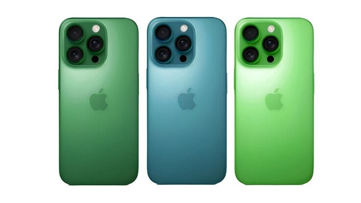
The iPhone 17 Pro is shaping up to be one of Apple’s most visually daring releases yet, according to recent rumors. Set to arrive in four standout colorways-Black, Dark Blue, Silver, and a bold Orange-Apple appears to be leaning hard into aesthetics after a year dominated by AI talk. 
The hero shade? That orange, reportedly inspired by the Action Button on the Apple Watch Ultra, described as “vibrant yet balanced”-a far cry from the minimalism Apple usually pushes.
The Dark Blue tone is said to be so deep it can look black depending on lighting-think of it as a spiritual successor to the iPhone 15 Pro’s Blue Titanium. Meanwhile, the Black option brings a matte twist on Black Titanium, while the Silver leans toward a warmer take on White Titanium.
Perhaps the most curious part? The design has sparked comparisons to Android phones, especially the Poco X5 Pro. Several online voices are claiming that the iPhone 17 Pro looks like Apple’s first flirtation with budget design-unusual for a phone likely to cost over $1,000. With a possible switch back to aluminum frames-ditching the titanium trend-critics argue Apple’s playing it too safe in the innovation department. “Aluminum again? Everyone’s doing that. At least stick with the titanium you hyped up,” one user quipped.
Some fans are also baffled by the omission of previously rumored shades like green, purple, and sky blue, which are now expected to grace the standard iPhone 17 and the new iPhone 17 Air. And Apple being Apple, there’s a mysterious fifth color in the works, rumored to be revealed closer to launch-some speculate a “liquid glass” look might be on the table.
So while the tech might not be groundbreaking just yet, Apple seems to be betting big on bold hues and a nostalgic return to old materials to carry the iPhone 17 Pro into the spotlight. Whether that’s genius or lazy remains up for debate-but it’s already making noise.